AI Enabled Components
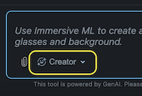
Lens Studio AI is an AI-powered tool from Snap AR that simplifies the creation of Lenses by allowing you to generate AR experiences using prompts.
When using the Creator Mode it draws from a range of Custom Components - each adding a new feature to the system.
For example, the Background Image component adds a generated background behind the user, the Makeup component chooses makeup to add to the user's face and the Screen Sticker component provides a sticker with opacity, determining its position, rotation and scale.
| Background Image component | Makeup component | Screen Sticker component |
|---|---|---|
 |  |  |
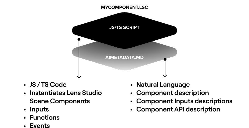
Each component has their own "AiMetadata" markdown file that describes to the system how to add it to the scene and how to appropriately change its parameters, provide it with generated content, call its APIs or respond to events it exposes.
Now, you can connect your own Custom Components to Lens Studio AI, extending its capabilities by simply adding a markdown file to it that explains its inputs, events and functions. You can then publish them to the asset library so that anyone in the community can install them and use them with Lens Studio AI.
You may also refer to AI Enabled Custom Components as Blocks, which is shorter :). Nevertheless, the both refer to a Custom Components with additional metadata for AI attached to it.
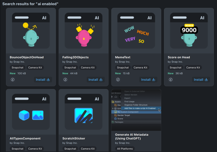
You can find these AI Enabled Custom Components in the Custom Components section of the Asset Library. Look for the custom component with AI on it. OR, search for AI Enabled in the search box. Alternatively, check out the examples in the repository.
Getting AI Enabled Custom Components
Like other custom components, you can find these AI Enabled custom components in the Asset Library under the Custom Components section.
Look for Custom Components with the AI icon, or, search for AI Enabled.
To allow Lens Studio AI to access these additional components, press the Install button on the asset.
Any components that are installed in your Lens Studio can be found in the Package Manager.
They can be uninstalled from the Package Manager by selecting the gear icon and pressing Uninstall.
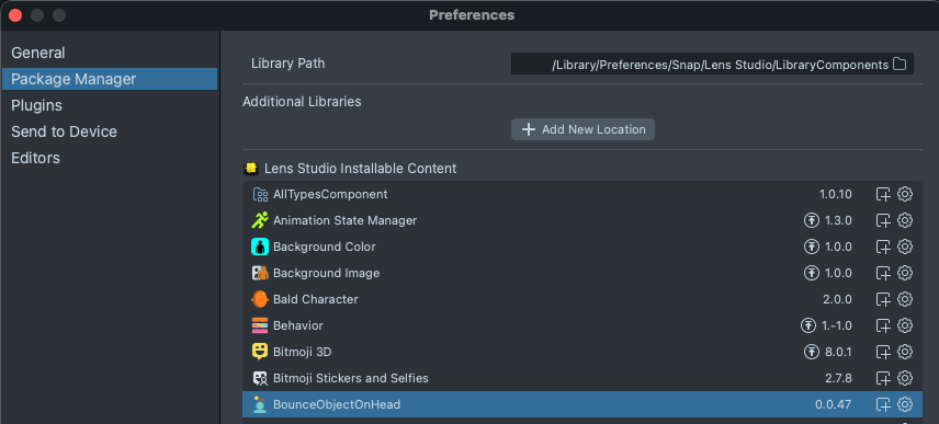
You can also add Additional Libraries to your Package Manager. This is useful for sharing your custom components with your team or several people, while not having it be publicly available.
Once a Custom Component with AI Metadata is in the Asset Library, Lens Studio AI will automatically be able to access them.
You will need to start a new conversation in Lens Studio AI to have it access a newly installed component.
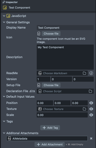
Adding AI Metadata
To make your own Custom Component AI Enabled, you just need to add a markdown file called "AiMetadata" with information about your component. You can manually create a markdown file or use an automatic tool.
The file name must be called "AiMetadata.md" to work with the system.
Creating and linking AiMetadata files
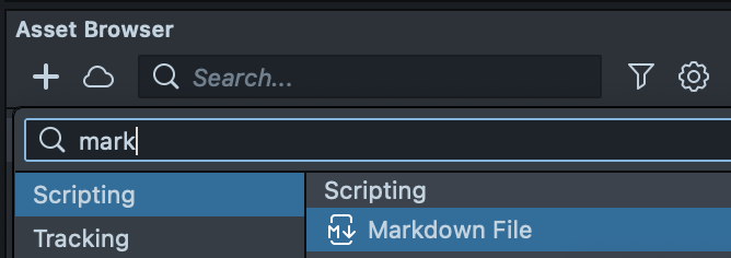
You can manually create a markdown file asset in the Asset browser panel > + > Markdown File.
Then, select your custom component in the Asset Browser panel, press + Add Attachment, and select the markdown you created.
Alternatively, you can generate a markdown and attach it to your component using AI.
In the Asset Library, search for Generate AI Metadata and press Install to install the plugin.
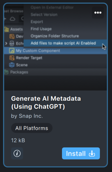
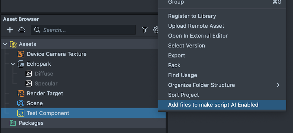
Then, right-click on your component, and select Add files to make Script AI Enabled.
To edit the markdown file, you can right-click on it in the Asset Browser panel, and press Edit Markdown in the Script Editor, or open it in the code editor of your choice.
Metadata markdown file format
Some input requires choosing from a predefined list. Below, the options are listed with a | between them.
# Name

Description: Describes the component and its functionality.
Render Layer: 3D Face | 2D Background | 3D Background | 2D Pre Background | 3D UI | 2D UI | 2D Foreground | 3D Foreground

## Composition Notes

Notes on component integration, e.g., "This component completely overlays the user's face; avoid adding face accessories or masks."

## Design Notes

Notes on how to set component parameters, e.g. "input1 should only be 0 if input2 is 2"

## Coding Notes

These notes are for the coding agent, describe how to use the API of your component (inputs/functions/events) for different scenarios

## Inputs

### inputName1

- Description: Describes the input and function. E.g., "10 is very small, 100 is very large, and 35 is normal."
- Type: string | int | float | boolean | ScriptComponent | vec2 | vec3 | vec4 | texture | glb | mask | fbx
- Default: default value (Can be omitted when using Asset Provider)
- Asset Provider: Sticker | Sprite | Image | 3D Object
- Asset Style: Describes what the Asset Provider should generate (must be provided when using Asset Provider).

## Functions

### functionName(arg1: Type1, arg2: Type2, ...):ReturnType

- Description: Describes the function and operation.
- arg1: Description of arg1.
- arg2: Description of arg2.

## Events

### eventName(arg1: Type1, arg2: Type2, ...)

- Description: Describes the event and trigger conditions.
- arg1: Description of arg1.
- arg2: Description of arg2.
In addition to the metadata, you can optionally add examples to help better align the LLM:
## Examples

### Example 1

- Description: Create a scratch sticker of a smiley face.
- Comment: Provides a large smiley face scratch sticker at the center of the screen.

#### Inputs

- sticker: "Sticker illustration of a smiley face, black and white only, bold, thick outlines, high contrast, simple graphic style. Clear contours, playful and iconic design."
- center: [0,0]
- size: 1.4
- rotation: 0
- strokeWeight: 0.05
vectors, if used, are represented by square brackets e.g. [0,1,1].
Concepts
Asset providers
AI Enabled Components can be connected to generated textures or 3D Objects, through "Asset Providers". They have a field called Asset Style that determines the prompt to generate the asset.
See the example above about how these are declared in the AiMetadata file
Types of asset providers
-
Image
The sticker asset provider generates a full screen image texture (with a fixed 4:7 aspect ratio) that can be used in your custom component's texture parameter.
Example Asset Style: "A quaint flower garden with a cobblestone path."
-
Sticker
The Image asset provider generates an image texture that can be used in your custom component's texture parameter, that has opacity.
Example Asset Style: "A cartoon style sticker of a bowl of ramen"
-
Sprite
This is similar to Sticker, but will not have a white outline. This is useful for textures that you want to embed into other layers–e.g. A character in a game.
Example Asset Style: "A love heart with realistic shading."
-
3D Object
The Image asset provider generates an image texture that can be used in your custom component's texture parameter, that has opacity.
Example Asset Style: "A 3D cup of coffee."
the 3D Object will be provided as a prefab. You should instantiate this prefab to display the 3D object in your scene.
Render Layers
The system has several predefined cameras / layers within the scene hierarchy that the custom component is added under. Choose from the following options in order of first to last:
| Render Layer | Description |
|---|---|
| 2D Pre Background | For 2D objects that are to be rendered before the background, behind everything else. |
| 3D Background | For 3D objects that are to be rendered in the background, behind everything else. |
| 2D Background | For 2D objects that are to be rendered in the background, behind everything else. |
| 3D Face | For 3D objects that are intended to be attached to the face. |
| 3D Foreground | For 3D objects that are to be rendered in the foreground, in front of everything else. |
| Post Effect | For 2D post effects, rendered below the UI elements. |
| 2D Foreground | For 2D objects that are to be rendered in the foreground, in front of everything else. |
| 3D UI (Safe Region) | For 3D objects that are to be rendered in the foreground, in front of everything else. |
| 2D UI (Safe Region) | For 2D objects that are to be rendered in the foreground, in front of everything else. |
If you do not want your component to be added under a camera, you can set the render layer as null.
Lens Controller
Lens Studio AI can add a controller script to the scene called the "Lens Controller" which is used to add interactivity to a lens, and it has references to all of the components in the current lens. As a result it can enable/disable components, change component inputs, call component functions, and respond to component events.
Composition, Coding and Design Notes
Notes that can guide the LLM to better understand and use your AI Enabled Component.
Composition Notes
Impacts Lens Studio AI's decision to use your component in response to certain prompts, or avoid conflicts between different contradictory components, e.g. 'do not add more than one 3D hat', 'The spooky pumpkin component is appropriate for lenses with a horror theme'.
Design Notes
Impacts the initial setting of the lens component's parameters, e.g. 'do not set the scale to 0', 'do not position outside of X range'.
Coding Notes
Guides how the 'LensController.js' script should interact with your component's parameters, functions and events.
Best Practices
- Make sure any prefab or objects created by the custom components use its Render Layer so that when it is instantiated by Lens Studio AI it will be rendered by the correct camera (Lens Studio AI will only affect the render layer of the custom component itself).
- When using 2D render Layers, your component will automatically be added to an object containing Screen Transform
- 2D Render Layers are using Canvas with a Unit Type of World. If you're finding that your 2D elements do not look right (too big / small), check that its size / properties are designed for a Unit Type of World.
- When asking AI to change input, make sure to define a getter/setter property so your custom component updates when a generated Lens controller triggers changes.
- During testing you can ask for your Custom Component directly, but make sure to try your Custom Component amongst other components known by Lens Studio AI. If you make the component's name too generic, Lens Studio AI might not get the right one.
Next Steps
Now that you understand the fundamental concepts, take a look at the Tutorial to try making your own!