Backplate
This is a component created to help situate content in AR space. If you have some text, an alert, or a dialog, but you don't want it to float without any context,
Component Breakdown
Render Order | Sets the renderOrder for the visuals of the element. |
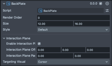
Size | Sets the size of the element. X is width, and Y is height. |
Inactive | Makes the element impossible to interact with. Think "grayed out". |
Play Audio | Turns on the built-in audio cues for the element. |
Add Callbacks | Adds the editor hooks for the event callbacks to the element. |
On Value Changed Callbacks | A callback for when the element's value changes. |
On Interaction Finished Callbacks | A callback for when the element interaction and changes are all finished. |
Enable Interaction Plane | Turns on an Interaction Plane for the element. An InteractionPlane defines a zone which triggers near field targeting logic for HandInteractors. |
Interaction Plane Offset | A translation offset for the interaction plane trigger volume. |
Interaction Plane Padding | A padding to extend the interaction plane trigger volume beyond the size parameters of the element. |
Targeting Visual | A dropdown selection for which targeting visual the interaction plane uses when it is activated. Options are None, Cursor, Ray. |
Code Example
- TypeScript
- JavaScript
import { BackPlate } from 'SpectaclesUIKit.lspkg/Scripts/BackPlate';

/**
 * Example script for the BackPlate component.
 * It creates a back plate and sets its size and style.
 */

@component
export class ExampleBackPlateScript extends BaseScriptComponent {
  onAwake() {
    const backPlate = this.sceneObject.createComponent(BackPlate.getTypeName());
    backPlate.size = new vec2(15, 20);
    backPlate.style = 'dark';
  }
}
// Import required modules
const BackPlate = require('SpectaclesUIKit.lspkg/Scripts/BackPlate').BackPlate;

/**
 * Example script for the BackPlate component.
 * It creates a back plate and sets its size and style.
 */

function onAwake() {
  const backPlate = script.sceneObject.createComponent(BackPlate.getTypeName());
  backPlate.size = new vec2(15, 20);
  backPlate.style = 'dark';
}

// Start the script
onAwake();
Was this page helpful?