Frame
This is a component created to help situate content in AR space. If you have some text, an alert, or a dialog, but you don't want it to float without any context,
Component Breakdown
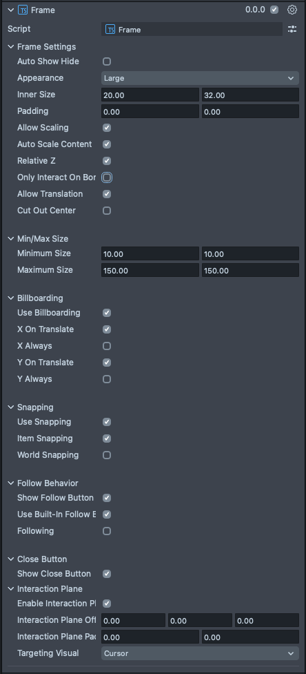
Auto Show/Hide | Enables and disables the built in show-on-hover behavior. |
Appearance | A dropdown selector for the appearance of the Frame's UI offering. The options are Large and Small. Each sets the width of the border and changes the size of the builtin buttons. Large is appropriate for far-field interactions, while Small is more suited to near-field. |
InnerSize | Sets the size of the element. X is width, and Y is height. |
Padding | Sets additional padding on the Frame. X is width, and Y is height. This padding is not affected by the resize interaction by dragging the corners. Which makes it useful for adding constant sized UI to your frame, like a toolbar. |
Allow Scaling | Turns on the corner dragging scale behavior for the Frame. |
Auto Scale Content | Means that any of the user provided content of the Frame will be rescaled along with the Frame's scale behavior. |
Relative Z | Means that the content will also scale on the Z during the Frame's scale behavior. It is useful to turn this off to maintain the Z depth of your content. |
Only Interact On Border | Makes it so you can only control the Frame on its border. This is useful if you don't want the drag behavior on the Frame when clicking in its center. |
Allow Translation | Enables the drag to reposition behavior on the Frame. |
Cutout Center | Dims out the center of the Frame, and only leaves the border visible. |
Minimum Size | The minimum size that the Frame can be scaled to with its drag behavior. |
Maximum Size | The Maximum size that the Frame can be scaled to with its drag behavior. |
Use Billboarding | Turn on the billboard component for the Frame. |
X On Translate | Will billboard on the X axis during Frame translation. |
X Always | Will billboard on the X axis always. |
Y On Translate | Will billboard on the Y axis during Frame translation. |
Y Always | Will billboard on the Y axis always. |
Use Snapping | Enable the Frame's snapping behavior options. |
Item Snapping | Enables Frame-to-Frame snapping behavior. |
World Snapping | Enables Frame-to-World snapping behavior. |
Show Follow Button | Turns on the Frame's top-right corner Follow Button. |
Use Built-In Follow Behavior | Will activate the built-in following behavior when the follow button is toggled on. |
Following | Toggles on the follow button and the built-in behavior. |
Show Close Button | Turns on the Frames top-left corner Close Button. Note: this does not come with a built-in behavior. You will have to attach to the button to define your close behavior. |
Enable Interaction Plane | Turns on an Interaction Plane for the element. An InteractionPlane defines a zone which triggers near field targeting logic for HandInteractors. |
Interaction Plane Offset | A translation offset for the interaction plane trigger volume. |
Interaction Plane Padding | A padding to extend the interaction plane trigger volume beyond the size parameters of the element. |
Targeting Visual | A dropdown selection for which targeting visual the interaction plane uses when it is activated. Options are None, Cursor, Ray. |
Code Example
- TypeScript
- JavaScript
import { Frame } from 'SpectaclesUIKit.lspkg/Scripts/Components/Frame/Frame';

/**
 * Example script for the Frame component.
 * It creates a frame and sets its size and style.
 */

@component
export class ExampleFrameScript extends BaseScriptComponent {
  onAwake() {
    this.createContent();
    const frame = this.sceneObject.createComponent(Frame.getTypeName());
    frame.initialize();
    frame.innerSize = new vec2(15, 20);
  }

  createContent() {
    const child = global.scene.createSceneObject('Child');
    child.setParent(this.sceneObject);
    const text = child.createComponent('Text');
    text.text = 'Frame!';
    text.size = 200;
    const screenTransform = child.createComponent('ScreenTransform');
    screenTransform.anchors = Rect.create(-1, 1, -1, 1);
    screenTransform.offsets.setSize(new vec2(15, 20));
    screenTransform.position = new vec3(0, 0, 0.01);
  }
}
// Import required modules
const Frame =
  require('SpectaclesUIKit.lspkg/Scripts/Components/Frame/Frame').Frame;

/**
 * Example script for the Frame component.
 * It creates a frame and sets its size and style.
 */

function onAwake() {
  createContent();
  const frame = script.sceneObject.createComponent(Frame.getTypeName());
  frame.initialize();
  frame.innerSize = new vec2(15, 20);
}

function createContent() {
  const child = global.scene.createSceneObject('Child');
  child.setParent(script.sceneObject);
  const screenTransform = child.createComponent('ScreenTransform');
  screenTransform.anchors = Rect.create(-1, 1, -1, 1);
  screenTransform.offsets.setSize(new vec2(15, 20));
  screenTransform.position = new vec3(0, 0, 0.01);
}

// Start the script
onAwake();
Close Button Event Handling
The Frame's close button (located in the top-left corner) does not have a built-in behavior. You need to define what happens when a user triggers it. Common actions include hiding or destroying the Frame.
Setup Steps:
- In Lens Studio, select your Frame Component's SceneObject
- In the Inspector panel, enable Show Close Button
- Create a new script and attach it to the same SceneObject (or a parent)
- Use the
@inputdecorator to reference your Frame component - Add an event handler to the close button's
onTriggerUpevent
- TypeScript
- JavaScript
import { Frame } from 'SpectaclesUIKit.lspkg/Scripts/Components/Frame/Frame';

@component
export class CloseButtonExample extends BaseScriptComponent {
  // Reference to the Frame component - assign this in the Inspector panel
  @input
  frame: Frame;

  onAwake() {
    // Wait for all components to initialize before accessing the close button
    this.createEvent('OnStartEvent').bind(() => {
      this.frame.closeButton.onTriggerUp.add(() => {
        print('Close button triggered!');
      });
    });
  }
}
// Reference to the Frame component - assign this in the Inspector panel
// @input Component.ScriptComponent frame {"hint": "Frame component reference"}

// Wait for all components to initialize before accessing the close button
script.createEvent('OnStartEvent').bind(function () {
  script.frame.closeButton.onTriggerUp.add(function () {
    print('Close button triggered!');
  });
});
Was this page helpful?