Button
UIKit has multiple button components: RectangleButton, CapsuleButton, and RoundButton. Each button extends an underlying BaseButton component. So, they share a lot of functionality. For example, each button has a style dropdown to easily swap between visual styles. Another example is any button can be turned into a toggle. This means that, when triggered, it will "stay on".
Here is visual reference for each button:
RectangleButton
CapsuleButton
RoundButton
Style Dropdown
Component Breakdown
Here is the component panel for a RectangleButton
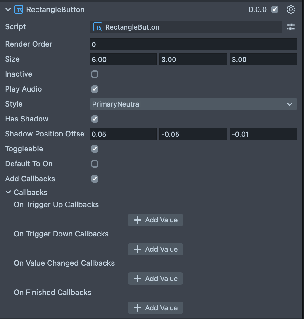
Render Order | Sets the renderOrder of the visual components of the element. |
Size | Sets the size of the element. X is width, Y is height and Z is the depth of the underlying collider. |
Inactive | Makes the element impossible to interact with. Think "grayed out". |
Play Audio | Turns on the built-in audio cues for the element. |
Style | Dropdown selects between the multiple visual styles available for the element. |
Has Shadow | Turns on the built in shadow for this element. |
Shadow Position Offset | (shows if Has Shadow is checked) The offset position for the shadow. |
Toggleable | Sets this element to have a toggle behavior. When triggered this element will stay on. |
Default To On | (shows if Toggleable is checked) Sets the default state of the toggleable element to "on". |
Add Callbacks | Adds the editor hooks for the event callbacks to the element. |
On Trigger Up Callbacks | A callback for when the element finishes a trigger lifecycle. |
On Trigger Down Callbacks | A callback for when the element starts a trigger lifecycle. |
On Value Changed Callbacks | A callback for when the element's value changes. |
On Finished Callbacks | A callback for when the element interaction and changes are all finished. |
Code Example
- TypeScript
- JavaScript
import { RectangleButton } from 'SpectaclesUIKit.lspkg/Scripts/Components/Button/RectangleButton';

/**
 * A simple programmatic button example
 */

@component
export class ExampleButtonScript extends BaseScriptComponent {
  onAwake() {
    // create new button
    const button = this.sceneObject.createComponent(
      RectangleButton.getTypeName()
    );

    // update button settings
    button.size = new vec3(10, 4, 1);

    // call initialize to finish button internal setup
    button.initialize();

    // attach events
    button.onTriggerUp.add(() => {
      print('Button fully triggered!');
    });
  }
}
// Import required modules
const RectangleButton =
  require('SpectaclesUIKit.lspkg/Scripts/Components/Button/RectangleButton').RectangleButton;

/**
 * A simple programmatic button example
 */

function onAwake() {
  // create new button
  const button = script.sceneObject.createComponent(
    RectangleButton.getTypeName()
  );

  // update button settings
  button.size = new vec3(10, 4, 1);

  // call initialize to finish button internal setup
  button.initialize();

  // attach events
  button.onTriggerUp.add(() => {
    print('Button fully triggered!');
  });
}

// Start the script
onAwake();
Was this page helpful?